Thesmallmonsters is a design team from Canada.
DORIANS snack food packaging design period is one of the representative works.
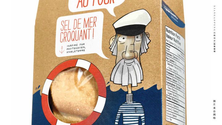
DORIANS products are derived from snacks made by the founder's grandmother.
Its raw materials and seasonings come from all over the world.
With tradition, health and high quality as the core selling points,
The audiences are mainly young people.
So Thesmallmonsters team created illustration characters as visual recognition symbols for product packaging.
These illustrations include sailors, cooks, farmers, cowboys and so on.
Although the figures in these illustrations are different,
But the unified visual style co-ordinated list perfectly interprets the concept of the core origin of the product.
At the same time, kraft paper with traditional and plain sense was chosen in packaging material.
Perfect interpretation of the core concept of DORIANS brand.
Original by 高鹏设计 Translate by ed
Disclaimer: The material in the article comes from the network. This subsite is reproduced only for the purpose of sharing (non-commercial). If you think the article may violate your rights, please contact us and we will deal with it accordingly. Where trademarks or patents are involved in the article, they belong to their respective owners.