Preface
Nowadays, the trend of minimalism is prevalent and permeates all fields of design. The concept and design method of minimalism have been applied to various food packaging designs. The simple style of food coincides with the green healthy diet concept advocated nowadays.
I. Minimalism as the Trend of Food Packaging Design
As a modernist design style, minimalism has great influence on food packaging design. The disadvantages of over-packaging, rational consumption, simplicity aesthetic popularization, environmental trend and other contemporary factors promote the development of simplicity in food packaging design.
(1) Overpacking of Food
At present, excessive food packaging is widespread. Mooncakes are the disaster areas of over-packaging. Over the years, the main packaging of moon cakes is aluminum box and iron box. The most appropriate description is "two catties of bamboo shoots and three catties of shells". The appearance of the products is single, not practical, and the price is very high. Excessive packaging is undoubtedly a way for businesses to gain higher profits by increasing product costs and selling them to consumers at high prices, which seriously damages the interests of consumers, and unpopular products are doomed to go a long way.
(2) Rational consumption of packaging becomes a trend
When people are consuming food, they are actually consuming packaging. Packaging is an important part of food value and an effective means of promotion. When consumers buy food, they not only look at the price, taste and function of the product, but also pay attention to the packaging of the product. After the drawbacks of over-packaging have become increasingly prominent, consumers are more and more in favor of the use of simple commodity packaging. Therefore, when consumers consume, they will consciously pay attention to food packaging, abandon excessive packaging, turn to appropriate packaging, packaging consumption concept tends to be rational.
According to China Business Intelligence Network 2017 "Youth Consumption Trend Data Report", with the gradual maturity of the post-80s and post-90s groups, young people's consumption behavior tends to be rational.
(3) The Popularization Trend of Simple Aesthetics
Now, simplicity has gradually become an aesthetic standard, and the beauty of simplicity has gradually entered the hearts of people. For food packaging with different styles, which attracts consumers'attention by elements such as color, shape and material, consumers gradually appear aesthetic fatigue, from feeling numb, boring to resisting. As Lao Tzu said, colors make people blind, and people are eager to return to simplicity and simplicity of the visual environment.
At the FBIF2017 Food and Beverage Innovation Forum, Yu Shuo, Director of Lile China Market Services, and his team's many years of research experience, explained in detail the five popular trends of packaging design: simplicity, vividness, humanistic nourishment, natural selection, high-end customization and trendy health.
According to Lile's 2016 survey data, China ranks first in the world. 53% of Chinese people are willing to pay for something that can save their time. Simply put, Chinese consumers are willing to spend money to buy time. One of the biggest business opportunities for China in the future is to save time for consumers. In this case, when designing packaging, we should consider how to present our information to consumers in the fastest, simplest and distinct way. The completeness of product information does not mean that the more the better. Too much information presentation sometimes easily arouses consumer disgust. At this time, we need to streamline packaging information to form a simple beauty.

Nongfu Mountain Spring Mineral Water
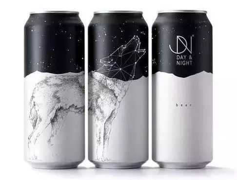
day & night beer
(4) Global Trend of Environmental Protection
According to relevant data, food packaging accounts for about 60% of the total packaging industry. The annual output of plastic packaging worldwide is between $80 billion and $120 billion, but 95% of these plastic packaging is used only once. Food packaging mostly belongs to disposable consumer goods, which seriously consumes resources. Many packaging wastes can not be degraded automatically (e.g. plastic), which can pollute soil, air and water. Food packaging waste is discarded in various environments, affecting the landscape and causing visual pollution.
Minimalism advocates functionalism and pays attention to the simplification of design elements (materials, colors, etc.). With the enhancement of people's awareness of environmental protection, the concept and method of minimalism are widely used in the field of environmental protection, and the food packaging of minimalism is undoubtedly in line with the trend of environmental protection.

2. Food safety attributes affect its packaging style
In 2008, the contamination of dairy products in China shocked the whole country, and food safety issues sounded an alarm to people. In September 2017, "poison warning" was popular in friends circles and microblogs. The net red beverage named "Kawa Chao Yin" was found to contain gamma-hydroxybutyric acid (a kind of psychotropic drug in China) after physical and chemical tests. Drinking too much would cause harm to human body. Public security departments in many places have asked to get off the shelves. Food safety incidents are common and even trigger various social contradictions. As a result, food safety has increasingly become a hot topic of common concern for different types of consumers.

According to Ipso Food Safety Survey, food safety is the primary consideration for consumers to buy products.
Businessmen insight into consumer psychology, more aware that food safety is both a challenge and an opportunity, and take advantage of the situation, have launched green, pure natural, non-added products, in order to win back the hearts of consumers. And these products, no matter from packaging design, color matching, text content, all follow the simplicity style; because the simplicity of food appearance always gives a clean, pure visual feeling and a solid sense of trust.

In 2017, Weiquan launched "Simple Point" yoghurt, which uses minimal blue and white color matching and handwriting. It is simple and generous as a whole, giving people a very pure and comfortable feeling. As soon as the product is launched, it is loved by many consumers, and its sales are also slowly rising.

Newcomer "Lechun" is the main yoghurt product of "fresh and clean like melon, fruit and vegetable". The packaging design style is simple and atmospheric.

Lechun yoghurt has gained a lot of praise and popularity since it was launched.
3. Simplification of Packaging Design Style in Global Food Industry
The representative of the succinct work is Japan. MUJI is not only famous for cosmetics and building crafts, but also for its snacks, which are popular with consumers all over the world. Muji snacks follow the consistent simplified style of its products, reflecting a minimalist, abstinent aesthetic feeling.

IKEA is the world's largest furniture and household goods merchant, known for its distinctive style of home products, but IKEA snacks are also sold in the wind and water. IKEA snack packaging is a simple "cold" style, no redundant complex information, no decorative elements but extremely practical and durable.

In 2016, the domestic brand Big White Rabbit Milk Sugar, together with the French fashion brand "agnsb." launched two rabbit-shaped limited collection editions of iron box milk sugar, blue and pink, which sold for nine times the original price. It is understood that when the limited edition of milk candy was launched, it was sold out in some outlets. This big white rabbit milk candy has minimal rabbit-shaped lines and pink colors. It is exquisite, compact and "high facial value". It is simple but not simple.

In 2016, Weilong Spicy Bar took advantage of the iPhone 7 to launch high-power packaging, strong screen brushing and hot network. Spicy strip packaging uses bright to luminous white background with black font, classical tones show high-end technology, white gives a sense of safety and hygiene, and closely matches the product attributes of spicy strip itself. This time, the simple wind of apathy swept the food industry again, and the cold feeling made consumers don't want to stop.

Huayi team designed rice series packaging for Pengdun rice industry is also a minimalist trend. Through precise grasp of color, text and illustration, we designed a pure packaging full of original ecological flavor, which conveys Pengdun brand's concept of "cherishing life and loving things, revering nature" as well as the quiet and indifferent ideological realm to consumers.

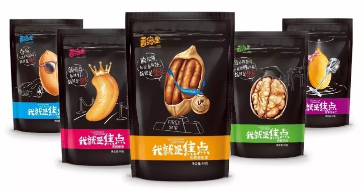
Pentawards, an international packaging design award known as the "Oscar" in the packaging industry, has won a gold medal in food packaging design in the past two years. Most of the works have used classical black tones in color, showing a concise high-end style as a whole. Intage, a Japanese Market Research company, conducted a color market survey in 2013. The results showed that black was the most luxury color in the eyes of Asian consumers in China, Japan, Thailand and Vietnam, accounting for 48.5%.
Huayi team has skillfully used the classic black tone in the nuts series packaging designed for Shanghai Xiangyuanli. The cold black makes the product mysterious from inside to outside. The packaging is more textural and the overall design style is simple and fashionable. Through vivid and interesting illustration forms, the product's personality and fashion are vividly interpreted. Taste, firmly grasp the eyes of consumers.
Nowadays, the trend of the whole design is to simplify and develop. Food packaging is no exception. From the consumer's point of view, today's Chinese consumers are intellectually capricious and ambitious, so they pursue simplicity. The extreme aesthetic sex-cold commerce is the new favorite of the rising post-80s and post-90s main consumer forces.
Huayi's View
1. Simple food packaging design style adheres to the principle of "less is more", which does not mean blind deletion, but to simplify the product elements, highly extract information, so as to achieve accurate, clear, clear and powerful visual effect, to highlight the quality of fine details.
2. The simplification of products can start from the safety attributes of food and the design style of external packaging. The content of advertising text is particularly important. The soft power of culture can not be underestimated.
3. Not all products are suitable for simplicity, which depends on factors such as product positioning, consumer groups and so on.
4. Human tastes and preferences have obvious periodicity, 30 years is a cycle, and we are just in the period of the prevailing simplicity. Businessmen should aim at the goal, seize the opportunity, and act according to the situation.
original by 施夏珍《食品包装设计的简约主义内涵》 translated by ed
Disclaimer: The material in the article comes from the network. This subsite is reproduced only for the purpose of sharing (non-commercial). If you think the article may violate your rights, please contact us and we will deal with it accordingly. Where trademarks or patents are involved in the article, they belong to their respective owners.